

10 Major Signage Design Mistakes to Avoid
Wayfinding plays a critical role in helping people navigate complex places such as hotels, hospitals, malls, and offices. A well-designed wayfinding system guides visitors effortlessly. Poor signage can cause confusion and frustration. Here’s why partnering with wayfinding signage consultants matters: they create clear, accessible systems that make navigation simple for everyone.
By understanding and avoiding the most frequent signage design mistakes, businesses can create a more efficient and welcoming environment. We'll explore major sign design errors and how expert intervention can resolve them effectively.
1. Lack of a Clear Signage Strategy
One of the biggest mistakes in wayfinding design is starting without a clear strategy. A strong signage strategy guides people seamlessly through a space. Without a clear plan, misplaced or missing signs can cause confusion, delays, and frustration.
A strong wayfinding strategy considers the entire visitor's journey. A strong wayfinding strategy identifies key points in the visitor journey and strategically places signs where they're needed most.
A clear strategy improves the intuitive navigation, reduces stress, enhances visitors' experience and avoids costly changes later.
2. Poor Sign Placement and Visibility
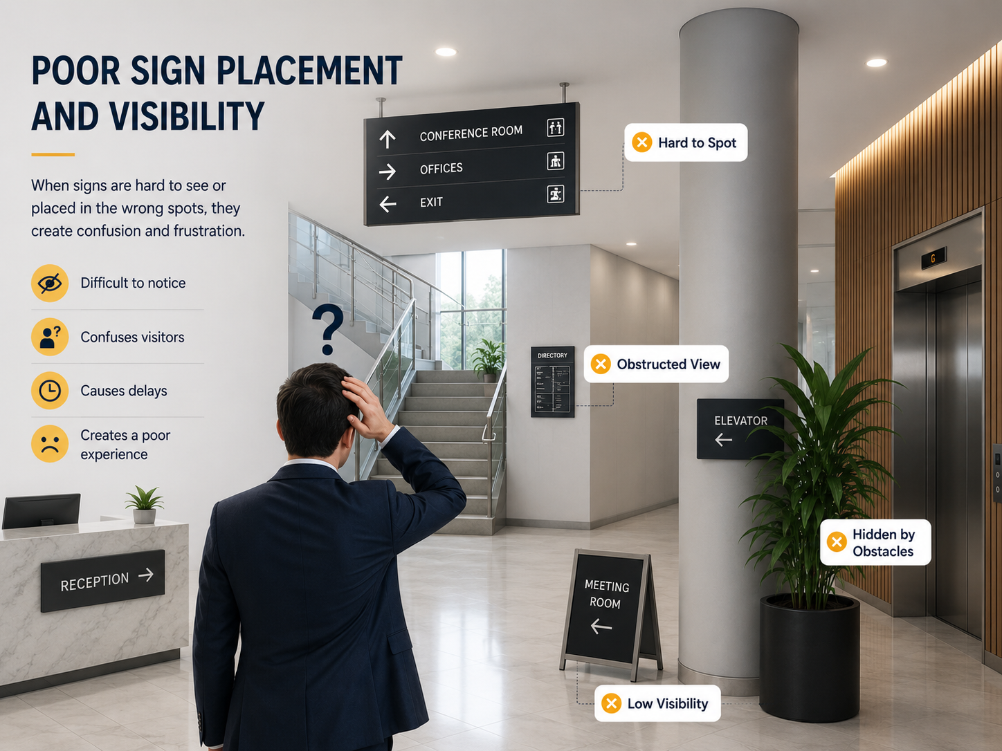
Even well-designed signs won't help if it is not placed in the right place. Poor sign placement is a common mistake that can lead to missed turns, delays, and visitor confusion.
Signs should be visible at key points such as intersections, stairways, elevators, and exits where people need directional guidance.
Effective signage should also be clearly visible and readable from a distance and free from obstructions. When signage is placed thoughtfully, it is easy to spot and make decisions that help people move confidently through any space.
3. Overcrowding signs with Too Much information
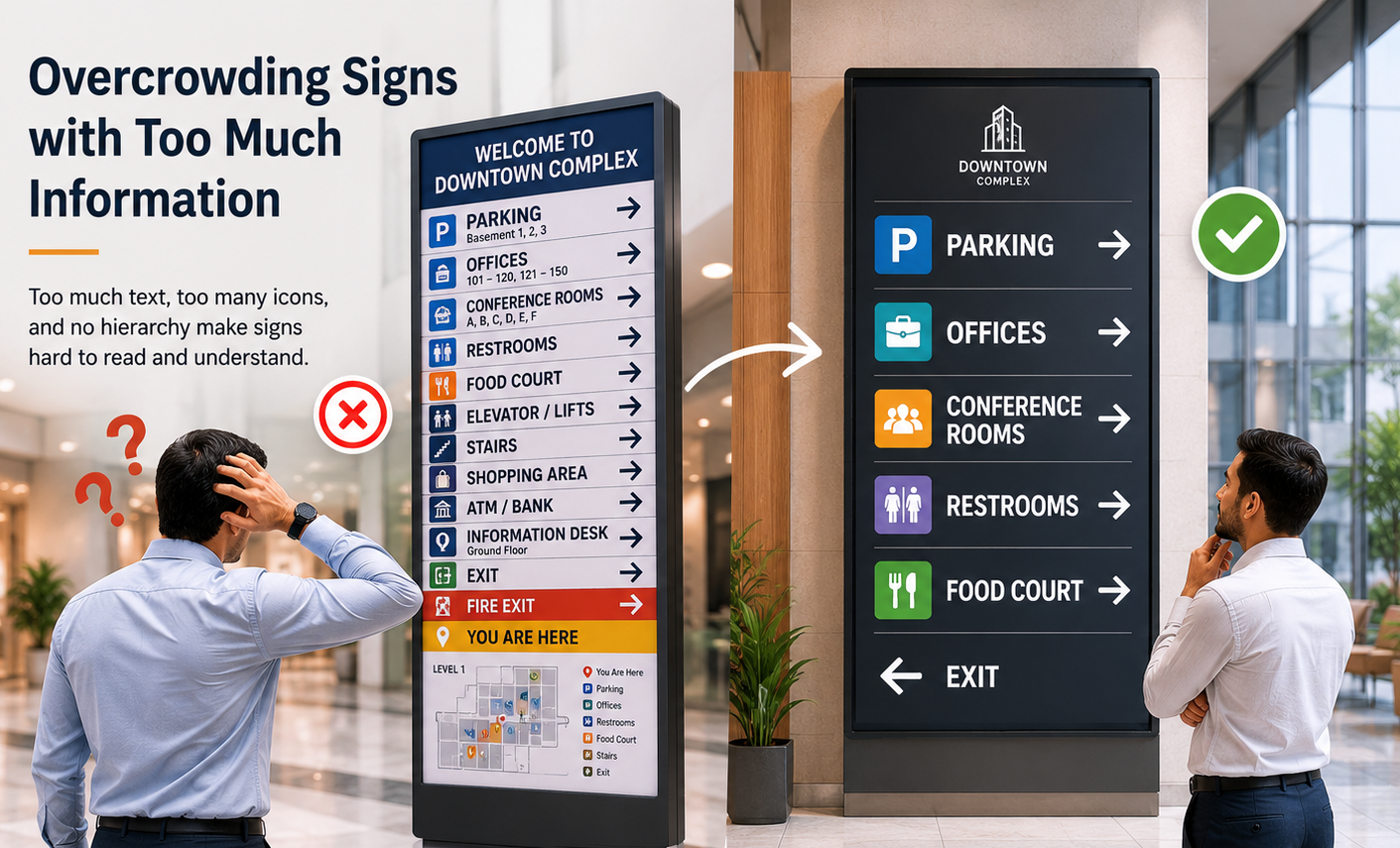
Too many symbols and text on a sign confuse visitors rather than directing them. In a situation of information overload, people either ignore the sign or misread it.
Effective wayfinding signs must be clear, concise, and easy to scan. Visitors are moving, so every word must have a purpose. Try to use simple language and keep instructions limited per sign.
A clear, minimalist sign minimises stress, accelerates decision-making, and guides people towards the right path.
4. Using Inaccessible Designs for Diverse Visitors
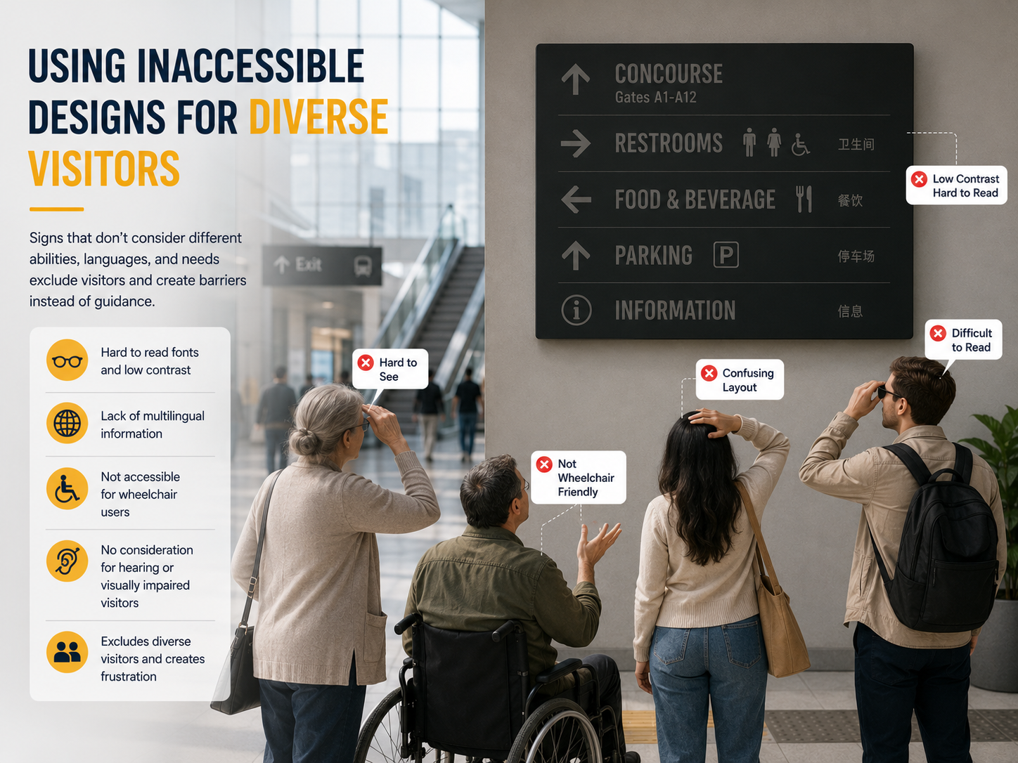
Wayfinding signs should work for everyone, not just a specific group of users. A common mistake in signage design is failing to consider the diverse needs of all visitors, such as seniors, people with disabilities, or those who speak different languages.
Poor signage design can make spaces confusing and unwelcoming. Small fonts are hard for older adults to read, while low-contrast text poses challenges for those with vision impairments.
Use large, high-contrast fonts, simple language, and clear icons to make signage easy for everyone to understand. Install signs at accessible heights for all users, including children and wheelchair users.
5. Using Low-Contrast Colours and Hard-to-Read Fonts
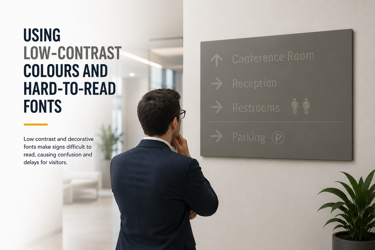
One of the most common mistakes in wayfinding design is using low-contrast colour combinations or fonts that are difficult to read.
Low-contrast colours and decorative fonts may look stylish, but they will be difficult to read, especially for people with visual impairments. To ensure clear visibility, use high-contrast colour combinations, simple sans-serif fonts, and appropriately sized text.
Try to avoid using all uppercase letters, as they can make text less readable. Well-designed signage improves accessibility, user experience, and wayfinding effectiveness.
6. Inconsistency in design elements
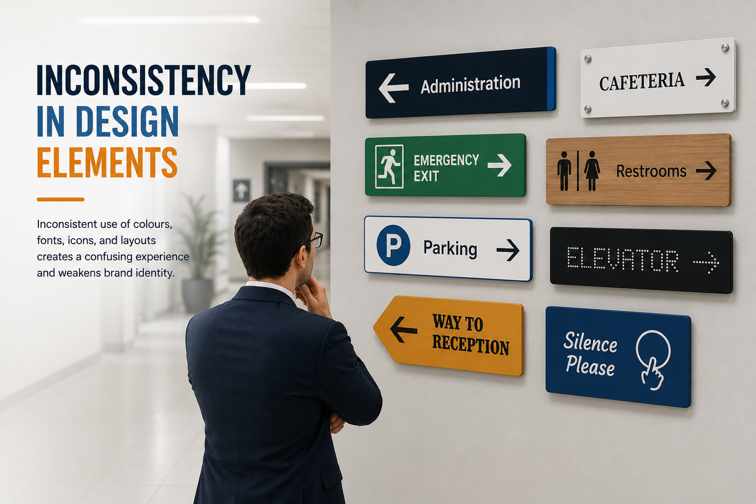
Inconsistent design, such as using different fonts, colours, icons, or layouts, makes it harder for people to recognise and follow directions.
Wayfinding works best when there's a visual language that remains consistent throughout the environment. For example, if one sign uses blue text and arrows, but another uses red with a different font, users may not realise the signs are related.
To avoid this, keep the same size, fonts, colour schemes, and icon sets across all signage. Stick to the consistent layout; it not only improves user experience but also strengthens brand identity. A cohesive design helps visitors move confidently through a space without confusion.
7. Failing to Maintain or Update Signage Over Time
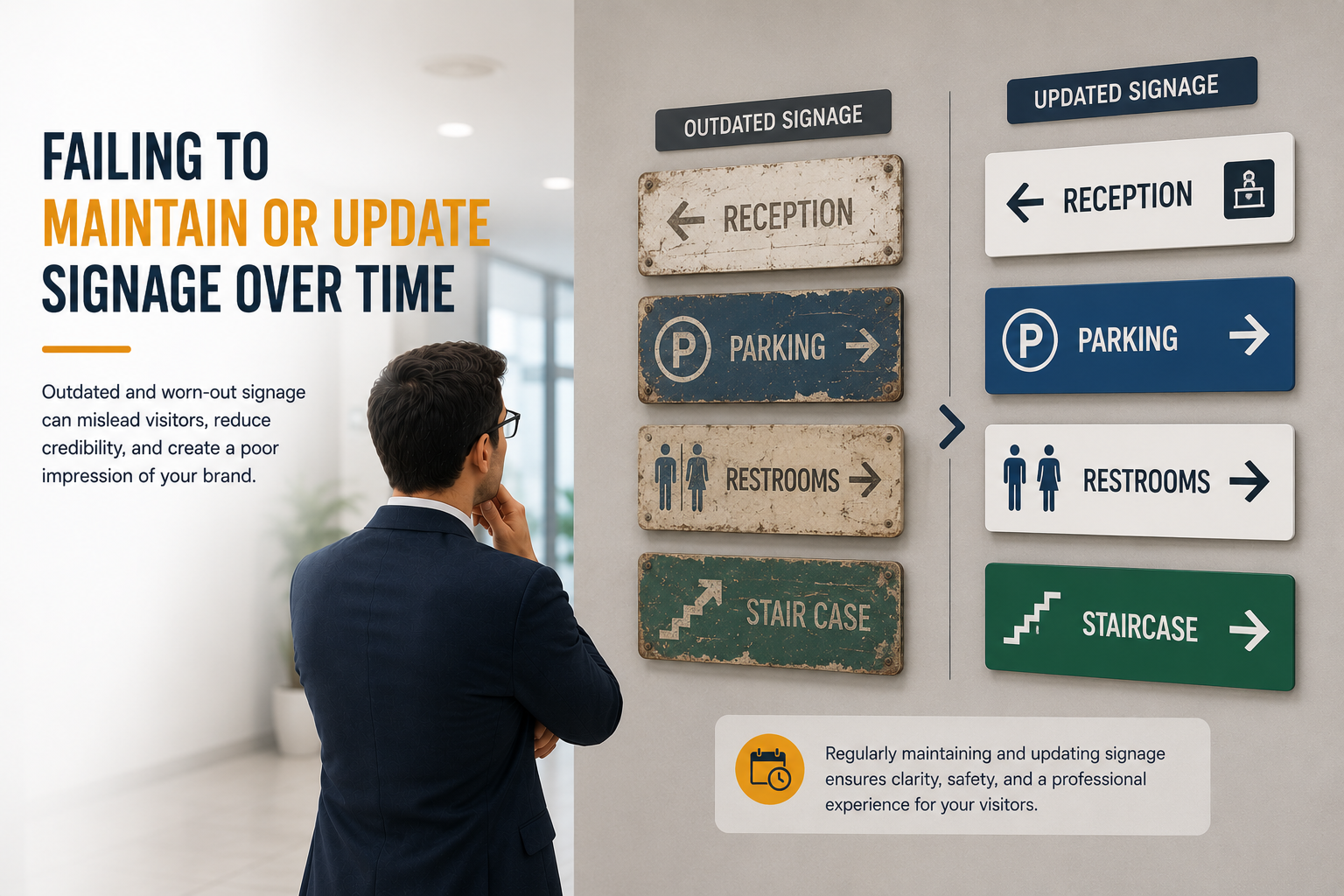
Even the most effective signage systems might lose their impact if they aren't regularly updated. Failing to maintain or update signage is a common mistake that can lead to confusion and frustration for visitors.
Damaged, faded, or outdated signs can confuse visitors and undermine trust. Try to keep, clean, and update signage to ensure information remains accurate, visible, and professional. Well-maintained signs support smooth navigation and reinforce a positive visitor experience.
Keeps signs clear, accurate, and professional regularly. Make sure a smooth visitor experience facilitates efficient wayfinding.
8. Ignoring the Use of Pictograms and Visual Cues

Relying solely on text in signage can limit clarity, especially in high-traffic areas or when serving diverse users. Ignoring pictograms and visual cues removes a critical layer of quick, universal communication.
Visual symbols help people who don’t speak the local language, have reading difficulties, or are simply in a hurry. Icons like arrows, restroom signs, or elevator symbols offer instant recognition and direction.
Use universal pictograms to enhance wayfinding processes. Keep icons simple, consistent, and highly visible, and pair them with clear text to ensure easy understanding for all users.
9. Not Testing Signage with Real Users
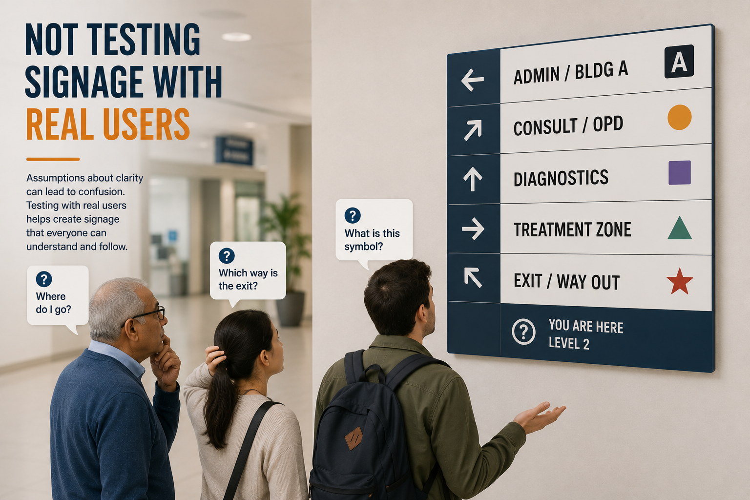
Real-world testing is necessary for a wayfinding system, rather than relying solely on design mockups for review.
User testing reveals issues like confusing messages, poor visibility, or absent directional hints, aiming to make signage intuitive, functional, and easy to follow.
User testing can be simple yet highly effective. Observing visitors, gathering feedback, or conducting trial runs helps identify areas for improvement.
By involving real users, you can create signage that is user-friendly, efficient, and better suited to real-world navigation needs.
10. Skipping Professional Signage Design Consultation
Wayfinding is not just more than a installing sign. Signage can become inconsistent and confusing without professional planning. Wayfinding consultants help create clear and accessible systems by applying expertise in layout, visual hierarchy, and user behaviour, which ensures a better experience for all visitors.
Without expert guidance, signage can be poorly placed, difficult to read, or inconsistent in design, which can lead to confusion rather than clear direction. Working with signage and wayfinding consultants in Dubai or your local area ensures your system is well-planned, visually consistent, and aligned with industry standards.
Elevate Your Space with Flawless Wayfinding
Creating effective wayfinding signage is about more than just avoiding mistakes; it's about building a seamless, intuitive, and welcoming experience for every visitor. From the moment someone enters your space, your signs are a silent guide.
Get it right, and you enhance brand perception, reduce visitor stress, and ensure smooth traffic flow. Get it wrong, and you risk confusion, frustration, and a negative lasting impression.
As we've seen, pitfalls like poor visibility, inconsistent design, and a lack of accessibility can undermine even the best intentions. The most effective way to sidestep these common errors and create a world-class wayfinding system is to partner with experts who specialise in signage design.
Ready to Create Signage That Truly Guides?
Don't let easily avoidable signage mistakes impact your visitor experience. Our team of expert wayfinding consultants is here to help you develop a clear, consistent, and accessible signage strategy from the ground up.